The Targets and Actuals Graph is a time series visualization designed to display indicator actuals and targets over time. It's the most complex indicator visualization we offer. We affectionately call it TAAG. For other visualizations, check out the map, pie chart, and Matrix.
- Layout
- Targets
- Pros and cons of TAAG
- You can opt between one of four styles:
- Time scale
Layout
The vertical axis label is the unit listed on the indicator's definition tab. The scale is generated automatically based on the range of data entered. The axis values are formatted using the number format defined on the indicator's definition tab (e.g. percentages will show as percents).
The horizontal axis measures time.
Though the Targets and Actuals Graph is downloadable, it is designed to be highly interactive:
- You can hover over items in the legend to highlight them in the graph
- You can hover over the graph itself to get details on individual data points
The Legend provides the color and label for categories and disaggregations that are displayed in the graph. The order of disaggregation categories depends on the data totals for those values and the style type selected. For column and line charts, the disaggregation category with the greatest total value is displayed at the top of the legend. For stacked column and area charts, the disaggregation category with the greatest total value is displayed at the bottom of the legend.
When a disaggregation has many categories, we limit the number of categories displayed to the top 10. Anything above that gets too visually cluttered and overwhelming. We do this by taking the nine categories with the highest values and then group the remaining categories together in an Other category.
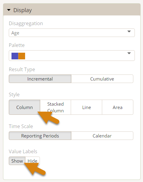
To display indicator result values on the graph, select the column style graph in the display section and choose show for the value labels.
When you download a graph, you can choose whether or not to include the indicator name in the image.
Targets
Global and project targets are shown as gray bars or lines, depending on the graph, under certain circumstances:
- When there are no disaggregations are selected to visualize, global targets are always displayed.
- When disaggregations are selected, no global targets are displayed (because we do not support disaggregated targets).
- When a graph is disaggregated by project and only one project is visible, project targets are displayed. One and only one project will be visible if 1) a single project is linked to the indicator, or 2) all other projects are filtered out of the visualization.
Pros and Cons of TAAG
As a time series graph, TAAG is ideal for viewing progress over time, either overall or split out by disaggregation. When targets exist for the indicator, the graph will also display those targets relative to the actuals when it can.
Note: Since targets are not entered per disaggregation, the graph cannot display targets and disaggregations at the same time.
While TAAG is great for many things, it is designed to identify relative trends in data and to provide specific values through interactivity (by hovering over a point). For true detailed comparisons of data over time, use the Matrix option to view the numbers behind the visualization.
Column Style
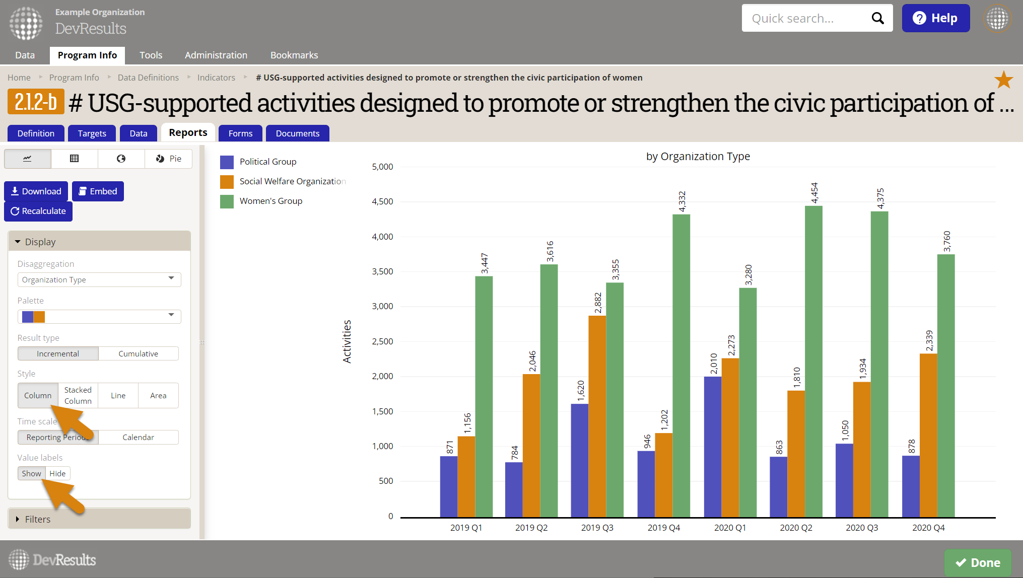
Column creates a grouped column display, displaying each disaggregation as the same color column over time, and in the same column order, so you can easily compare disaggregations to each other over time. If a disaggregation is selected, the disaggregation category with the greatest total is displayed at the top of the legend and will be the column furthest to the left. This style also lets you choose to display value labels for each column: in the display section at the bottom, click on "Show" under "Value labels".
Great For
- Easily comparing different disaggregations over time, using the same baseline
- Displaying value labels
Bad For
- Comparing disaggregations together over time
- Identifying small differences over time
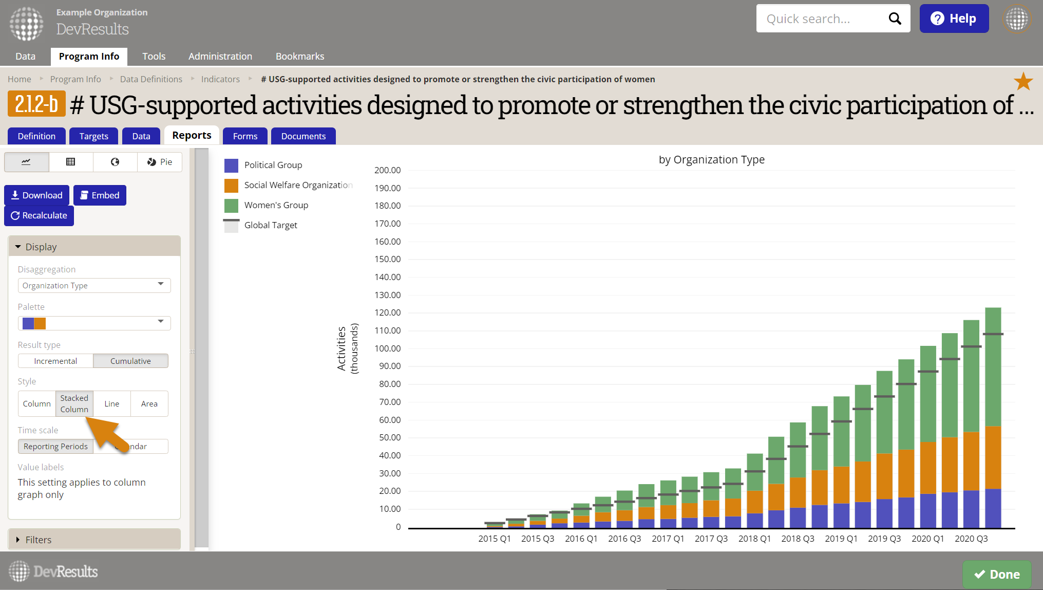
Stacked-Column Style
Stacked Column creates a stacked column display, displaying each disaggregation as the same color column block over time, and in the same vertical order. This is a great way to maintain the visual simplicity of a non-disaggregated column display, while providing some insight as to how that total is broken down by disaggregation category. If a disaggregation is selected, the disaggregation category with the greatest total is displayed at the bottom of the legend and will be the column that begins from the horizontal axis.
Great For
- Displaying totals for individual reporting periods over time, visually broken down by disaggregation
- Comparing the total actuals against the overall targets
Bad For
- Comparing disaggregations against a common baseline
- Easily comparing disaggregations against themselves over time (since they aren't displayed at the same baseline consistently)
- Identifying small differences over time
Because the sweet spot for Stacked Columns is to display different disaggregation categories and to add them up together visually into a single stacked column, we do not allow you to select this option for non-sum indicators (such as percents or other averages). Visually displaying something as a sum when it's actually an average is very poor form in data visualization, so we prevent you from doing it here.
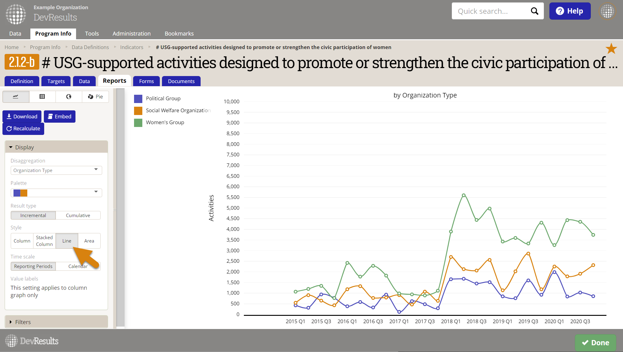
Line Style
Line creates a continuous line graph over time. If a disaggregation is selected, the disaggregation category with the greatest total is displayed at the top of the legend.
Great For
- Displaying small differences in data over time
- Displaying data that is continuously captured at the same intervals (e.g. quarterly, annually, etc.)
- Displaying trends over time (e.g. is this upward or downward trending?)
Bad For
- Data that is erratically captured or only captured once at the start or end of a project.
- Data that is only captured once, such as at the start or end of a project--this shows up as a single point, which is not very useful.
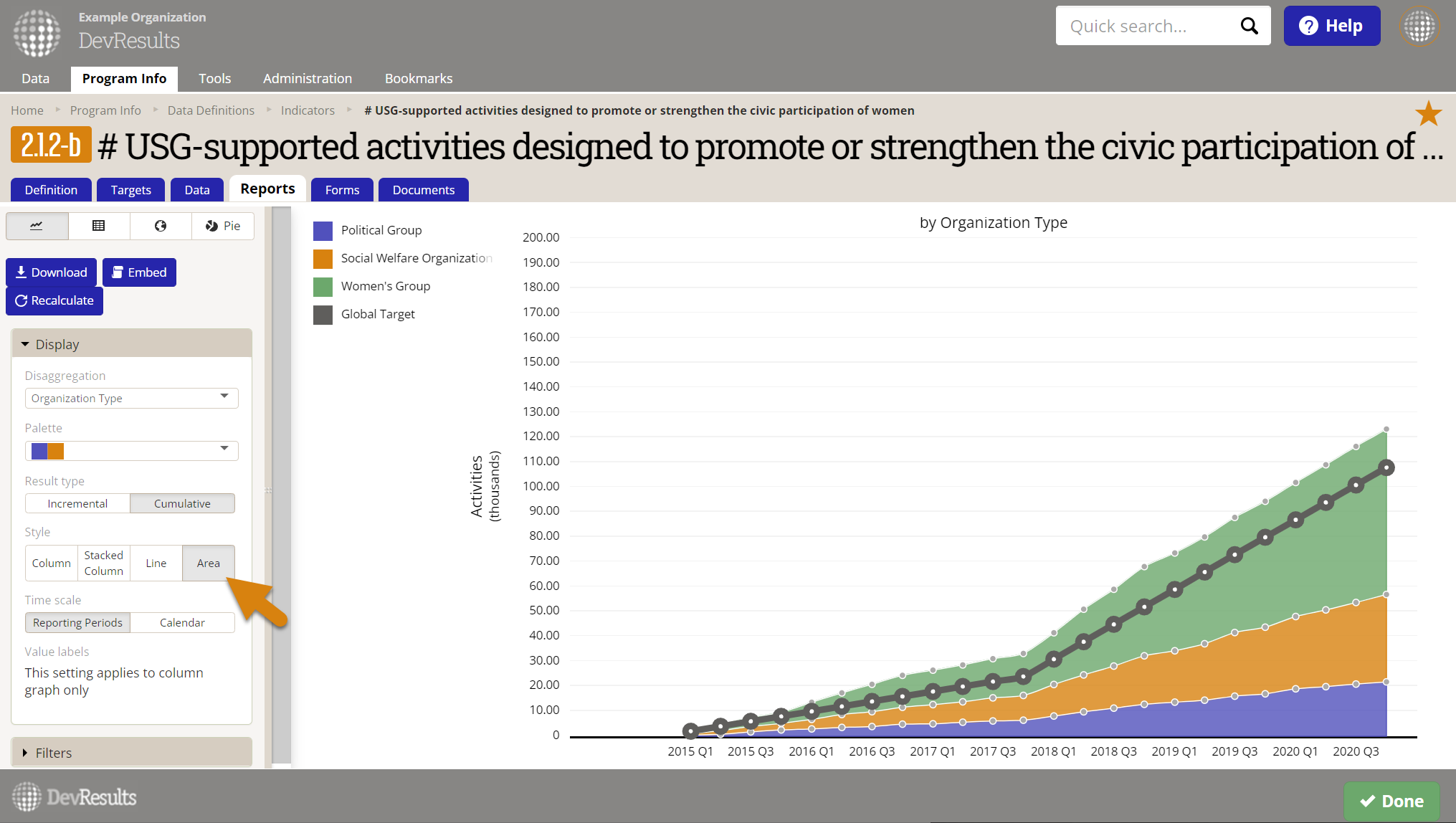
Area Style
The Area chart creates a stacked area display, similar to the line chart. But, like the stacked column chart, it allows you to compare each line's area in relation to the total or whole. This combines the trend analysis of a line chart with the part-to-whole comparison of a stacked chart. If a disaggregation is selected, the disaggregation category with the greatest total is displayed at the bottom of the legend and will be the area that begins from the horizontal axis as a baseline.
Great For
- Displaying continuous totals for individual reporting periods over time, visually broken down by disaggregation
- Comparing the total actuals against the overall targets
Bad For
- For pure trend analysis of how each line varies over time, the line chart is a better choice. It takes more mental processing to make sense of individual lines in Area because the higher lines are based off of the lines below them.
- Comparing disaggregations against a common baseline (line or column is better)
- Easily comparing disaggregations against themselves over time (since higher lines are based off of other lines rather than the axis baseline)
- Identifying small differences over time
Like Stacked Columns, because the sweet spot for Area is to display different disaggregation categories and to add them up together visually, we do not allow you to select this option for non-sum indicators (such as percents or other averages). Visually displaying something as a sum when it's actually an average is very poor form in data visualization, so we prevent you from doing it here.
Time Scale
The horizontal axis measures time. You can toggle the Time Scale here to change the horizontal access between Reporting Periods and Calendar. If the calendar setting is used, the data is placed using the relevant reporting period's End Date.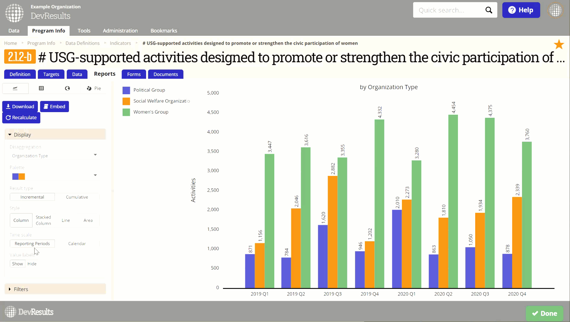
Didn't answer your question? Please email us at help@devresults.com.